An online interface for associating latitude/longitude coordinates with administrative units
This post presents a data exploration tool developed by EDJNet. If you have a spreadsheet with longitude and latitude columns and would like to have a look at those data on a map or associate them with administrative units across Europe, you may well find this tool useful. You can try this online, or check out this screencast for an overview of its main features. The interface is available also through the R package latlon2map.
Scientists across different disciplines are increasingly taking up the nice habit of publishing the datasets that emerge from their research, and these often include geolocated data. The same is true with open data distributed by public administrations: more and more, such datasets include geocoded information.
All of this sounds like a great starting point for data journalists. If the data is available for a large area, for example, it will surely take just a minute to extract the data for a given region or municipality, and use them to write a story for a local media. Right?

I feel that every single person that has worked with open data to any meaningful extent went through such moments of naive optimism at least once when finding out about the availability of a given data source. In particular when the dataset is the result of scientific research, excitement quickly turns into despair, as accessing such open data often requires using different programming languages, having familiarity with coding and at least the basics of geocomputation.
In some instances, the complexity of the data may make this inevitable. In other cases, the issue may simply be that data formats that seem perfectly readable for a given target audience need to be translated into something that can be understood by non-professionals.
Latitude, longitude, and data
Geo-located data are distributed in a variety of formats. For many of them, just double-clicking on the downloaded file will bring-up… well, nothing. But sometimes the relevant dataset is distributed as a spreadsheet. And data journalists love spreadsheets.
In the roller coaster of hope and despair that characterizes data journalism endeavours, a spreadsheet is a good sign, but often not quite enough. For example, let’s take a nicely formatted spreadsheets with three columns: latitude, longitude, and a value. Journalists need to report on places, locations, administrative units, anything that will make sense to their readers, and then often aggregate data. So, how do we go from here?
In this post, I will go through this relatively common case, and introduce a tool that will hopefully make it much easier to overcome the initial difficulties.
What about some ornithology?
To showcase this scenario, I will use an openly-licensed ornithological dataset of bird sightings. This is mainly to keep things simple, without giving too much thought to substantive analysis. Also, the pandemic pushed more people to look out for birds and care about them. As their numbers are decreasing so rapidly, more of us should care about birds, really. Also, I like birds.

Let’s move on to data analysis.
I have this dataset with all sightings of Alcedo atthis (better known as kingfisher) and of Phoenicopterus roseus (the flamingo) recorded on the eBird platform in the last two weeks in and around Europe.
I open the spreadsheet, and it looks like this:
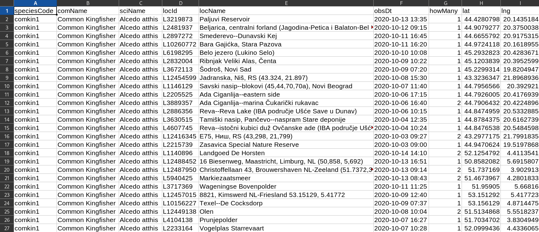
Well, at least it’s a spreadsheet!
There is a location column, but it is not consistent. How do I know in which countries or areas there have been more kingfisher sightings? Or maybe I only need to pass the data to a colleague who is working on bird sightings in my local newsroom, but we are only interested about sightings in a given region, or even municipality, and don’t care much about an international dataset. There is latitude and longitude column there, but… still no easy way out, apparently.
So here is when our latest tool comes to the rescue. It allows to associate data points with latitude and longitude coordinates to different types of administrative units (all the way from country to municipality), preview the data on an interactive map, and export the result as a spreadsheet or as a map. This can be useful both for exploratory data analysis as well as for further processing.
The tool is available through an interactive online interface, or you can install it on your local computer (via R or Docker) for comfort if you want to process larger datasets.
Future versions may support other input formats (e.g. shapefiles), and more options for aggregating data.
Check out this screencast about some of the functionalities offered by this interface, and then check this out with your own data.
Looking for a dataset for testing? Here’s a slightly different dataset (a simplified version of the original available here), on flamingo and kingfisher sightings recorded on eBird during the month of October 2019. You can download it from here. And check out eBird’s website for all things birds!
If you are an R user, and want to run this on your own computer, you just need to run these two commands to find it open in your local browser:
remotes::install_github(repo = "giocomai/latlon2map")
latlon2map::ll_app()
If you are not an R user, but have Docker installed on your computer, this is all you will need to run in a terminal to find this interface in your local browser.
docker run -p 3838:3838 giocomai/latlon2mapBase maps for administrative units will be cached locally, and will be automatically downloaded at first run.
Again, here is the link to the online version if you want to try this out.