The messy data sources behind "Mapping diversity"
We have been toying with the idea of doing large-scale open-ended analysis of street names across Europe for quite some time.
Back in 2019, I quickly built an R package that facilitated retrieving the names of streets used in a municipality, tried to guess which were humans and the relative gender (simplistically operationalised as “sex at birth”), and provided a basic interface to check the data (here’s a walkthrough of the process).
The data you need to win the Olympics if you go NUTS
When everybody’s moved by the contagious joy of two athletes making history by agreeing to share an Olympic gold medal, the data analyst thinks: “two gold medals for the same competition? is this going to break my dashboard?”
"Can we have two gold? 🥇"
"Let's make history, man"#GOLD #Tokyo2020 pic.twitter.com/y2PATi92Jq
— Giuseppe Famà (@FamaNelMondo) August 1, 2021 In my case, I was worried it would break my parsing script.
Russophobia in Russian official statements and media. A word frequency analysis
N.B. For a better formatted version of this post, consider following this link
References to ‘anti-Russian sentiments’ or ‘Russophobia’ - have a long history that dates back to the 19th century (Feklyunina 2012; Darczewska and Żochowski 2015). However, in recent years references to the alleged spread of ‘Russophobia’ in the West have apparently become more common and more politically consequential, in particular after Russia’s annexation of Crimea and the war in the Donbas (Darczewska and Żochowski 2015).
Finding gendered street names. A step-by-step walkthrough with R
EDJNet has recently released the first pilot version of “Mapping diversity”: it shows for the main city in each of Italy’s regions how many streets are dedicated to men and women and includes details about who these streets were dedicated to. In a visually impressive format developed by Sheldon.studio with text and analysis by Alice Corona, it highlights that many more streets are dedicated to men than to women, and that many of those women are Catholic saints or other religious figures.
Visualising risk: a modern implementation of the Risk Characterisation Theatre
This post has originally been published on Medium by EDJNet
A different visual approach to associate likelihood of occurrence of a given event to the lived experience of people viewing the graph.
In their 2007 book “The illusion of certainty: Health Benefits and Risks”, authors Erik Rifkin and Edward Bouwer addressed a number of aspects related to the communication of risk to individuals and broad audiences, arguing that adequate communication of risk, including on the uncertainty embedded in risk assessments, is fundamental to personal and collective deliberations.

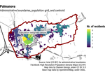
An online interface for associating latitude/longitude coordinates with administrative units
This post presents a data exploration tool developed by EDJNet. If you have a spreadsheet with longitude and latitude columns and would like to have a look at those data on a map or associate them with administrative units across Europe, you may well find this tool useful. You can try this online, or check out this screencast for an overview of its main features. The interface is available also through the R package latlon2map.
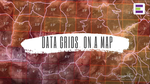
How do data grids look on a map? [3D video]
In this video, I point at some of the issues that characterise data grids and that may generate misunderstandings.
In the video, I mention how gridded data can be generated via satellite imagery and machine learning techniques. Of course, such data can be generated also via other means.
References This video is based on the data used for in this interactive web interface, presenting municipality-level data for most European countries:
Google Earth Studio as a data visualisation tool (with R)
Google Earth Studio is a fancy tool that allows for the creation of videos of stunning quality, by making it possible to create smooth transitions between locations across the globe, zooming in closer to the ground, and showing mountains and cities in 3D.
Here is their own promo video:
However, so far I have not really seen it used for data visualisation, nor I have seen any post online discussing how to use Google Earth Studio with data.
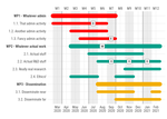
Beautiful Gantt charts with ggplot2
A new straightforward online interface that makes it easy to create and customise decent-looking charts for grant applications
How to find the population-weighted centre of local administrative units
A structured approach and a new R package to deal with a recurrent question