The messy data sources behind "Mapping diversity"
We have been toying with the idea of doing large-scale open-ended analysis of street names across Europe for quite some time.
Back in 2019, I quickly built an R package that facilitated retrieving the names of streets used in a municipality, tried to guess which were humans and the relative gender (simplistically operationalised as “sex at birth”), and provided a basic interface to check the data (here’s a walkthrough of the process).
Finding gendered street names. A step-by-step walkthrough with R
EDJNet has recently released the first pilot version of “Mapping diversity”: it shows for the main city in each of Italy’s regions how many streets are dedicated to men and women and includes details about who these streets were dedicated to. In a visually impressive format developed by Sheldon.studio with text and analysis by Alice Corona, it highlights that many more streets are dedicated to men than to women, and that many of those women are Catholic saints or other religious figures.
An online interface for associating latitude/longitude coordinates with administrative units
This post presents a data exploration tool developed by EDJNet. If you have a spreadsheet with longitude and latitude columns and would like to have a look at those data on a map or associate them with administrative units across Europe, you may well find this tool useful. You can try this online, or check out this screencast for an overview of its main features. The interface is available also through the R package latlon2map.
How do data grids look on a map? [3D video]
In this video, I point at some of the issues that characterise data grids and that may generate misunderstandings.
In the video, I mention how gridded data can be generated via satellite imagery and machine learning techniques. Of course, such data can be generated also via other means.
References This video is based on the data used for in this interactive web interface, presenting municipality-level data for most European countries:
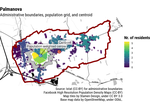
How to find the population-weighted centre of local administrative units
A structured approach and a new R package to deal with a recurrent question
European Elections 2019 and Italy's varying size
Among the many debates that follow elections, there is one that usually gets most attention among data journalists and people with an interest in data visualisation: electoral maps. This is not a purely aesthetic debate, as both newsreaders and political pundits make sense of election results through these maps, reaching often debatable conclusions.
A common one, for example, is the idea of a “country divided” as highlighted by Giuseppe Sollazzo in a post focused on maps published after the 2018 election in Italy.
The prequel to “Finding Tito”
(this post is now published also on balcanicaucaso.org)
A few weeks ago, out of curiosity, Davide Denti asked me if I knew how to parse OpenStreetMap data in order to find all streets and squares dedicated to Tito in the former Yugoslavia. I was unfamiliar with how OpenStreetMap stores data, but after a few quick attempts I managed to extract some data and produce a map that looked meaningful. Early feedback suggested that the data were incomplete, and I did not fully polish the data, but – aware that I would not have the time to work on this in the following weeks, and perhaps I would never pick it up again – I decided to make public the draft document I created.